
With 2.79 billion users worldwide, it’s no wonder Facebook is a top platform for digital marketers everywhere. But the same big numbers that make Facebook so great can also pose a marketing disadvantage — ad overload. Users are simply so used to being bombarded with Facebook ads, it’s a real possibility that they’ll scroll right past yours.
That’s why great design is more important than ever when it comes to your Facebook ads. But how exactly will you go about designing your next Facebook campaign? Before you start budgeting for ad spend, we’ve got a few tips for you to create a great Facebook ad design easily. Read on to find out how you can synergize visual impact with technical know-how and strategic marketing for Facebook ads.
1. Consider Your Facebook Ad Format
Facebook has several different ad formats that users can encounter on various parts of the interface. Depending on your ad content, your target audience’s behavior, or even your budget, you can choose to advertise using one or more of these Facebook ad formats.

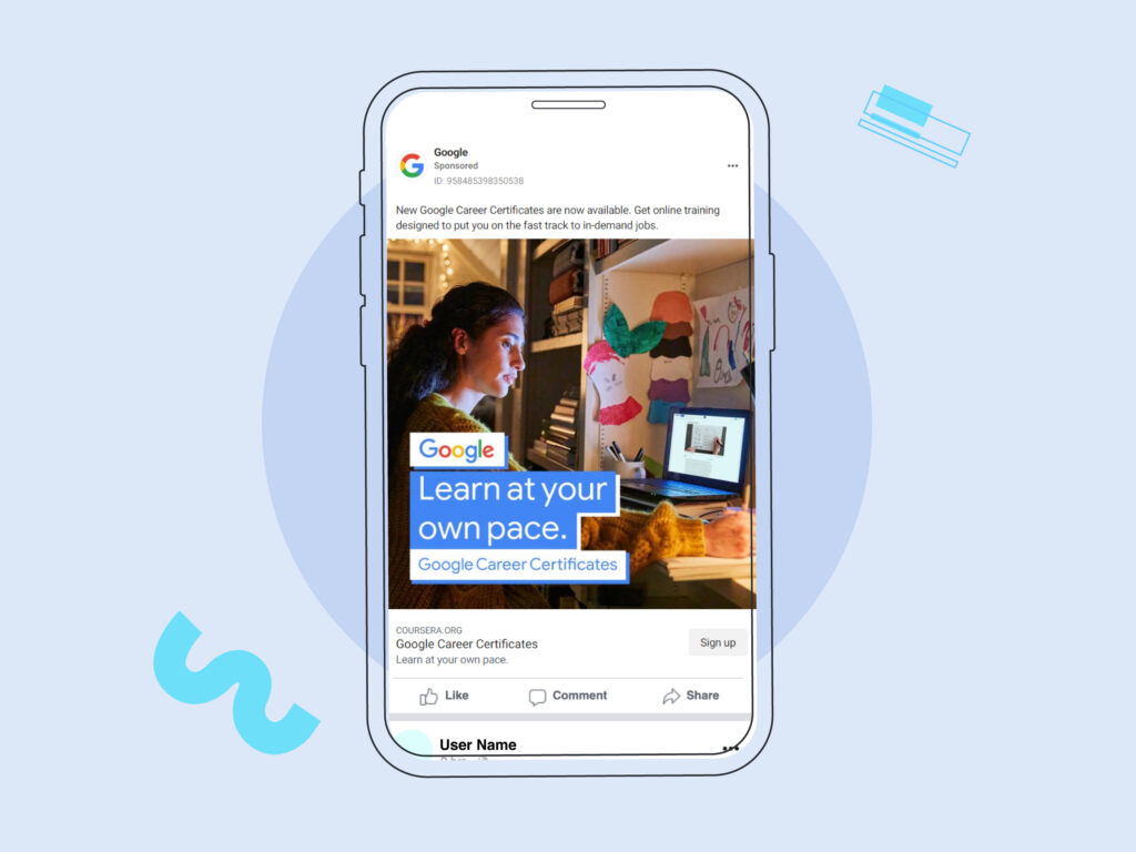
- Photo Ads (also known as image ads) are static graphics that use high-quality, professional images or illustrations.
- Video Ads come in different formats and durations. Since you can create a complete audiovisual experience, video ads are your chance to tell your story in motion. If you’re planning to add motion to your ads, read this guide on how animated Facebook ads increase conversions.
- Facebook Story Ads are mobile-based, full-screen images or videos that can be static, video, or even interactive.
- Messenger Ads help people engage with your business right from the Messenger app.
- Carousel Ads allow you to showcase multiple ad images or videos in a single carousel ad, each with its own link.
- Slideshow Ads are like mini-presentations, fast and easy to digest. They emulate video ads by featuring motion, sound, and text.
- Collection Ads are instant window-shopping experiences right in your target user’s feed.
- Playable Ads allow users to experience a free, interactive preview of your app or game, similar to a free trial.
- Instant Experiences, formerly known as Canvas ads, are purely mobile, full-screen, almost app-like experiences that instantly immerse your viewer in a branded environment once they tap on your video ad. They can be templated or created from scratch, depending on how tech-savvy your marketing team is!
Looking for inspo for your Facebook advertising campaigns? Check out these 33 Facebook Ad Examples to Inspire Your Creativity.
2. Design Around Your CTA for a Results-Oriented Ad
Facebook studies show that the average mobile user takes all of 1.7 seconds looking at an ad before deciding to scroll past. That’s why the main design principle to create the best Facebook ads is hierarchy — the art of making elements stand out in order of importance.

Your CTA, or call to action, is the first in a series of triggers that will lead your target customer through the sales funnel, starting with your landing page. Here are different kinds of CTAs you may need to create:
- You want them to sign up for a newsletter or to make a purchase. Collect data from leads by directing them to a form. Use CTAs like “Sign up” or “Register.”
- You want clicks for your website or online shop. Direct traffic to a selected landing page. Use CTAs like “Learn More” or “Shop Now.”
- You want to be seen by the whole neighborhood. Promote your business locally with a location-based ad — two-thirds of Facebook users say they visit a local business page at least weekly. Make sure relevant content, like your phone number or physical address, is in plain sight.
- You want to make an announcement. Create awareness for an upcoming event or product launch. Make sure relevant information, like dates, locations, and contact details (mobile phone, email address), is in plain sight.
If used appropriately, Facebook and instagram ads can really help you attract attention, increase brand awareness, and drive more sales.
But if your target audience is done looking before finding out your call to action, your ad has missed its mark. Get to the point quickly and you win the game!
3. Choose The Right Photos or Graphics For Your Facebook Ad Design
Your CTA may be on point, but the right ad image, motion graphic, or illustration can make or break your Facebook ad performance. Choosing images and ad designs is not an easy task. To come up with the right visual content, you can hire a photographer to take custom photos, get an illustrator to create personalized artwork, or have your graphic designer come up with brand-new engaging visuals and vector elements.
But sometimes, that’s simply too much work for what you have in mind. That’s why marketers and designers everywhere use stock photos to boost their graphics.
There are free options online, like Unsplash, Unblast, Freepik, and Pexels. If you have a Design Pickle subscription, you also have access to premium sources like Adobe Stock and Design Pickle’s homegrown vector library, FreshStock.
Whether you create your own visuals or use stock photos, never underestimate the power of Facebook ad images! Need some help? Check out our tips on designing social media graphics.
4. Use the Correct Size and Aspect Ratio for Each Ad Type
The ad types we mentioned in #1 each have different formatting requirements. Ads can also have several different requirements based on your intended ad placement — it could be on the feed, the right column, Facebook Marketplace, or Facebook Stories, among others.

Facebook’s guidelines may change throughout the years along with app updates and other advancements. That’s why they’re the best source of information when it comes to design recommendations and technical requirements for ads.
Before starting to create ads, check out the Facebook Ads Guide to learn more about the requirements for each ad type. They have a nifty interactive previewer so you can see what each Facebook ad type looks like in action.
Take careful note of the recommended file type, resolution, file size, official ad sizes, and more. Facebook even provides text recommendations for the ad’s accompanying captions. Make sure to keep your text just within the character limit to avoid getting cut off!
They may just be “recommendations,” but you can safely consider them as Facebook ad design requirements when it comes to images or video file specs. It’s best to stick to them as strictly as possible. If not, you run the risk of deploying an ineffective Facebook ad — something that may look more like a website error than a real link.
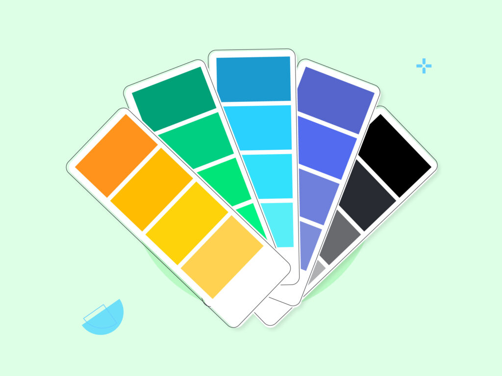
5. Select Colors Carefully
Don’t overestimate your target audience’s attention span. They may be scrolling fast enough to turn most text into an incoherent blur. That’s why the colors you use in your Facebook ad design can have just as much impact as your ad copy. Here are a few important pointers on color selection:
- Turn up the contrast. The higher the contrast, the stronger the impact. Contrast can be increased by using darker colors next to lighter ones. This way, elements are defined ultra-clearly.
- Stay on-brand as much as possible. Your brand voice can be asserted through color. If you’re looking for ways to create a cohesive aesthetic for Instagram, your color palette is the first place to start!
- Appeal to people’s emotions. Do some research on color psychology and make an intelligent guess* about what might work best for your specific audience. However, while there are some generalizations like “red is exciting” and “green is peaceful,” remember that you still have plenty of room to play. Red can represent anything from a fierce tech giant to a cheerful fast food chain; green can represent anything from a calm urban space to an exhilarating energy drink. Color is a subjective experience, and it’s how you use it that will truly make an impact. Bonus tip: Stick to a simple color palette. It’s enough to have two to three main colors that stand out.
*Did we just say you should guess? You heard it right. If you’re having a hard time deciding on the right images, don’t worry! In #8, we talk about split testing and why you can use two different options for certain elements — like color! — to find out what your audience best responds to.
6. Use Text Sparingly
The goal is to bypass ad overload and make a connection between you and your audience. That’s why you want to keep as little text as possible between the first glance and the CTA.
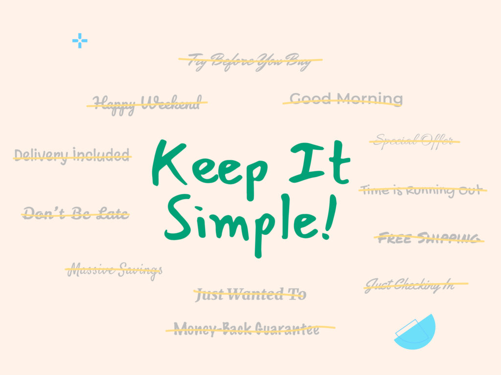
Come off as too salesy, too verbose, and many Facebook users will instantly tag you as a pesky ad and scroll past. Basically, if there’s something of interest to them in your ad, you don’t need to do too much explaining.
For text that is included in your image, try to keep it large and high-contrast, using a sans-serif font. For accompanying ad copy (or the ad’s “caption” on the platform), Facebook recommends keeping within 280 characters.
Think of this as your “grab-and-go” rule. Save any additional information for after they tap the CTA.
7. Use a Mobile-First Design Process
“Mobile first” is a web design term that emerged in the late 2010s as mobile internet usage gradually overtook desktop usage. It’s a principle that product designers use to make sure their app or website is accessible across platforms and devices. After all, you want to be viewed properly by the majority of your audience, right?

Today, the mobile world winds hands down, especially where social media is concerned. The best-performing video format on Facebook is vertical and more than 500 million people use Stories every single day.
Marketers and designers usually work on desktop computers or laptops, so it’s an easy mistake to make, thinking your viewers are looking at your ad the same way you make it.
But chances are, you’re connecting to your audience through their mobile devices. 98.5% of Facebook users access the app through their smartphones almost exclusively. That’s definitely something to keep in mind for all digital ad campaigns moving forward!
8. Use Split Testing to Improve Your Ad Design
Bad news, there’s just no knowing exactly how your audience will react to your ad until it’s published. But the good news is, you’re allowed to experiment with split testing, also known as A/B testing. With A/B testing, you can gauge your audience’s responses to two or more versions of the same ad, allowing you to optimize your strategy moving forward.
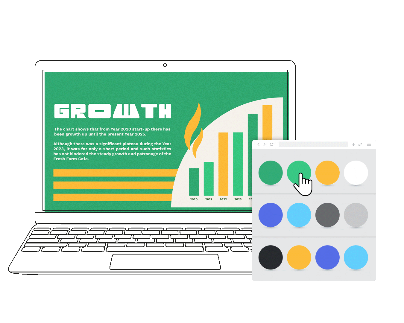
Facebook has a native A/B testing feature that you can access through their helpful Ads Manager Toolbar. Here are examples of variables you can test:
-
- Audience. You can test your ad on different locations or location ranges, different age groups, and other audience variables. If you have different audience personas, you can try your ad on each of them.
- Ad Creative. A creative A/B test involves making changes to visual elements. Here, you can test audience response to different colors, images, fonts, or more.
- Placement. Your Facebook ad can appear in any of a number of places, and you may be torn about whether it should go on the regular feed or on the Marketplace.
You can also test variables like different products or ad spend options. It’s also possible to opt for a “More than one” test, which allows you to test multiple variables for a single ad.
If you’ve gone so far as to invest in a skilled team to help create beautiful ads, then split testing is well worth the extra effort. This way, you find out what works, and you can design your next ads with clearer direction and more confidence.
Outstanding Examples of Effective Facebook Ad Design
The sheer popularity of Facebook can be a little overwhelming — there are moments in digital advertising that could feel like you’re shouting into a void. But on the other side of the coin, there are tried and tested ways to create Facebook ads get your brand the attention it deserves. Here are some homegrown visuals that we found effective in engaging our target customers!
1. Good Use of Typography
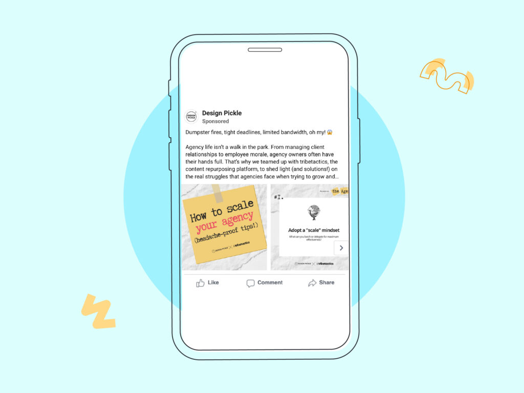
In a departure from the brand’s usual clean sans-serifs, this piece of content is advertised using an attractive, retro typewriter-style font.
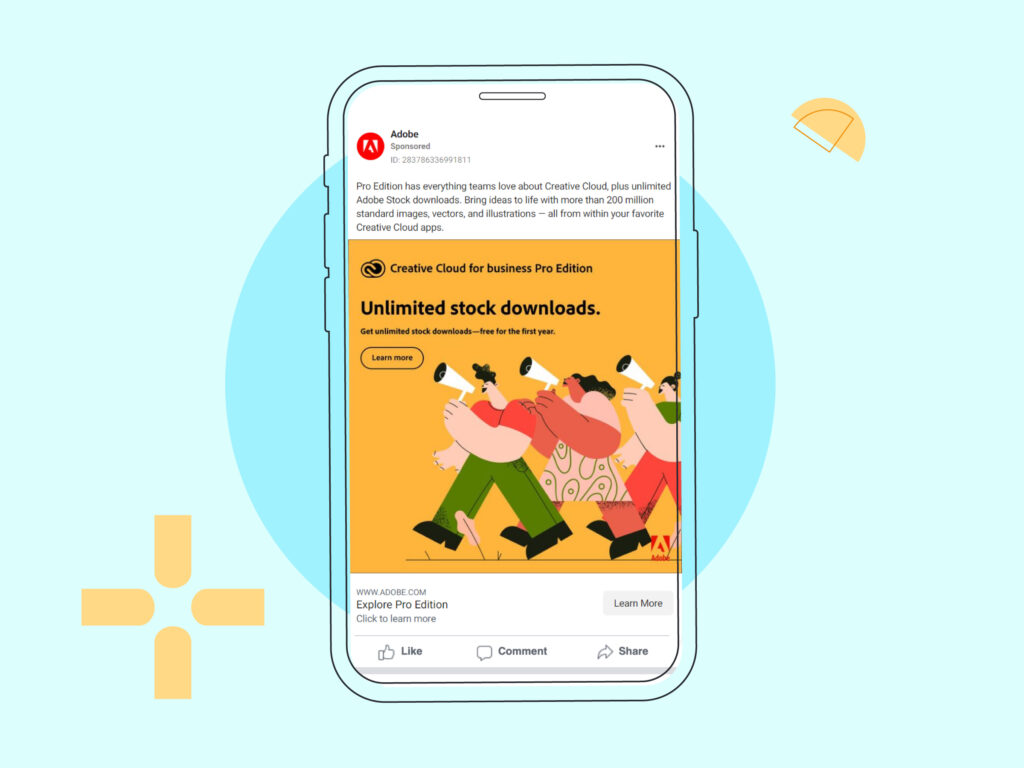
2. Good Use of Color
This simple testimonial was designed to draw people’s attention with a plain but popping, on-brand, sunny yellow background.
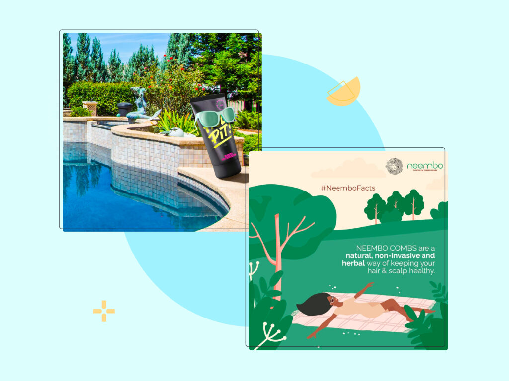
3. Good Use of Custom/Stock Illustration
This ad features a friendly, colorful illustration of humans — a surefire way to deliver the key message and spark engagement.
4. Good Use of Custom/Stock Photography
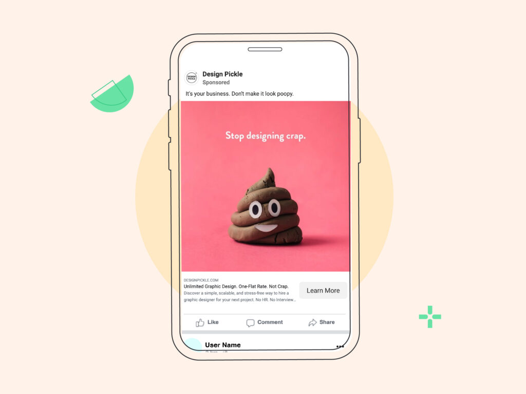
OK, we can hardly call an actual visual of crap “good,” but this is a pretty engaging use case scenario. The ad is deployed with a friendly smile, minimal text, and maximum impact.
5. Very Clear CTA
This Facebook ad design is an example of an effective visual hierarchy: The viewer’s eyes are instantly directed to the most important information first.
Need Professional Designs for Facebook Ads?
You don’t have to crunch them all out yourself. Design Pickle is the creative engine behind many businesses helping them simplify Facebook ad design— we can do the same for your social media. With unlimited requests and revisions, our designers can create smashing, on-brand digital ads for your business for a flat rate. Give your visuals some extra impact with custom illustrations and motion graphics, all available at Design Pickle. Take this tour of the Design Pickle service or explore our plans today.