
If you’re anything like us, you’re using professional presentations for client-facing engagement, internal communications, campaign development, and even board meetings. Creating a deck for every business need can be time-consuming, which is why a strong, on-brand, repeatable template is the key to creating a presentation layout that can be used for every occasion.
Beyond creating a visually engaging slide deck, pitching the content can often be stressful. But do not worry, public speaking is known to be one of the most common phobias (so you’re not alone!). And of course, a good grasp of the content you’re presenting along with preparation are your best friends. That’s why we’ve compiled a list of dos and don’ts that you can use to strengthen your presenting power as well as a zoom presentation guide if you’re presenting virtually. Read on to learn what is a slide layout and why it matters.
What is a Presentation Layout and Why Does It Matter?
A presentation layout is a basic structure that should guide and complement your verbal pitch. Often created in tools like PowerPoint (that comes with some built-in slide templates) or Google Slides, presentation layouts should leverage basic graphic elements to help you deliver your speech more effectively. It involves factors such as the formatting and positioning of your text, placeholder boxes for easy editing, text boxes, photos and illustrations, colors, typography, font sizes etc. Using professionally designed layouts allow you to create consistency and edit all these elements across your presentation simply by accessing the master slides. Hence, you don’t need to edit each individual slide manually as you’re adding or changing your layouts in the presentation theme itself.
All these features together result in a visually appealing pitch deck that speaks to your audience, helps them stay on track with the conversation, and keeps them engaged throughout the entire presentation.
How Do I Design a Good Presentation?
Try the Rule of Thirds for Better Engagement
Getting ready for your next presentation and worried about your slide design? You should know that cluttered slides can overwhelm your viewers. And let’s remember – no one wants to hear you read the content on your slides line-by-line (we’re already snoring at that point). If you’re building a powerpoint presentation and it’s feeling cluttered, you can attempt to pull a Marie Kondo and delete design elements, charts and content blocks when they don’t spark joy — but you can still end up with a less-than-appealing slide. What have you done wrong in the process?

The rule of thirds is a composition technique that involves positioning elements one-third of the way through a frame, instead of flushed left, right or dead center.
This structure ensures a few things:
- It directs your audience’s attention and eyes to crucial information
- Keeps the content you drop on your slide limited to key information that is easily understood
- Helps your audience hone in on a key visual or talking point
Use the Power of Images When Designing Presentation Layouts
Presentations come in many forms and have a variety of purposes. But, no matter what slide layouts you’re using, no one likes to see a slideshow presentation filled with walls of text and no image. A great idea is to keep text to a minimum and then break the monotony with images. A good general rule of thumb to follow when it comes to presentation design is more images, less text. In addition, try to keep text no smaller than size 22. This will help you accomplish two things:
- Limit the amount of text you can fit on your presentation slides
- Help your audience see the content when you’re presenting
The result? Audience engagement and information retention.
If you have more to say, a longer sentence onscreen isn’t the answer. Use your speaker notes section to store talking points beyond what is on the slide – and practice! Keep your presentation design limited to high-level text and large, relevant images.
If you want to enhance it further, think about using graphics in your PowerPoint or Google slides presentation.
Here are a few ways you can leverage images when you create presentations:
Images with Human Faces
We tend to be drawn to real people who share our traits and who can communicate with us and understand us. When your audience sees faces in your presentation, they may feel more connected to you.
This is a useful tool when you’re discussing things like consumer pain points. It’s not just because misery loves company. Human faces are also useful in aspirational marketing. People want to see an idealized version of themselves or their clients — could you be talking to them about something that will make them happier or more fulfilled? Keep that in mind when creating powerpoint presentations. Find out more tips on how to improve your PowerPoint presentations.
Combine Your Own Images with Large White Space
Slide layouts are the essential framework for your presentation. But instead of just slapping images onto your slides, you can take advantage of white space. In presentation design, white space refers to blank and empty space in a slide — and it doesn’t necessarily have to be white.

White space eliminates clutter and allows you to emphasize key points without worrying about the images distracting your audience.
Pick Images with a Sharp Focus
The last thing that you want is for your own presentation to look busy at the risk of distracting your audience from you or the text in your slides. Choose only photographs that have a sharp focus, meaning they highlight a specific subject and have a blurred background.
Full Bleed Images With Whitespace for Ultimate Attention
Full bleed or full-screen images cover the entire slide. They are captivating because they help emphasize your point. At times, you may need to add some short copy to provide context, so make sure you select images with plenty of natural white space where the text could go.
Fun fact! Don’t be fooled by the word “bleed” — it’s a term from the printing industry which means ink “bleeds” past the borders of artwork so there wouldn’t be any awkward blank spaces when the paper is cut.
Stressed just thinking about designing your presentation template? Don’t sweat it. We came up with 4 FREE presentation layout templates that you can customize for your audience and are packed with creative presentation ideas for further inspiration.
4 Free Presentation Design Templates
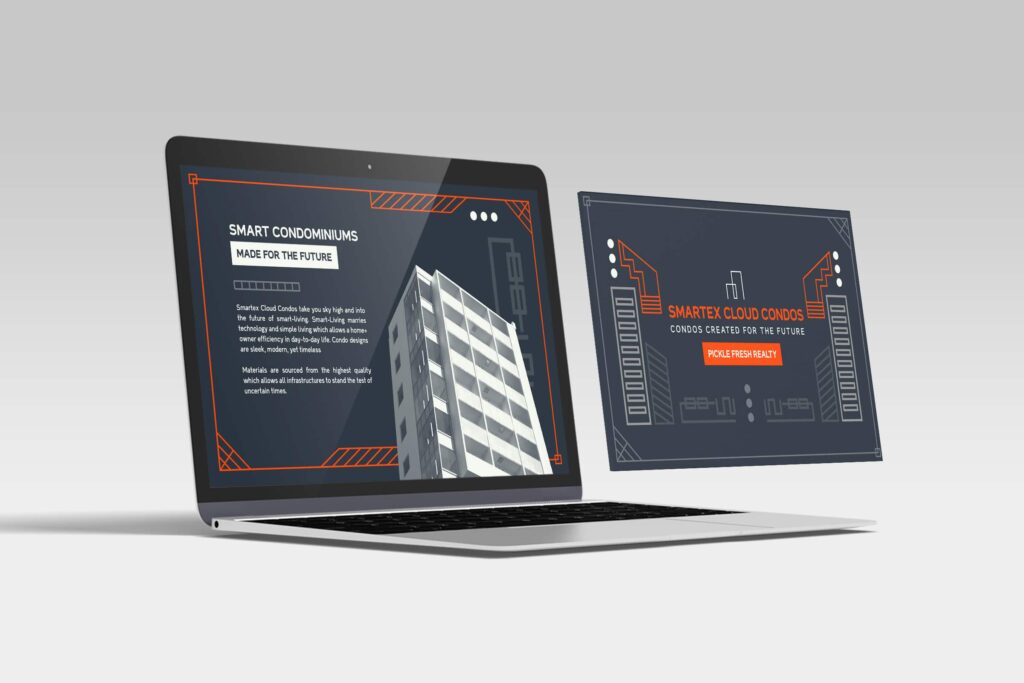
Corporate
Corporate presentations don’t need to be bland and stuffy to be taken seriously. It’s important to ensure that the information within your business presentations takes the highest priority. A good corporate presentation turns crucial data into easy-to-digest bits of information while commanding the attention of the audience. Looking for the perfect presentation template for your next slideshow? Download this template!
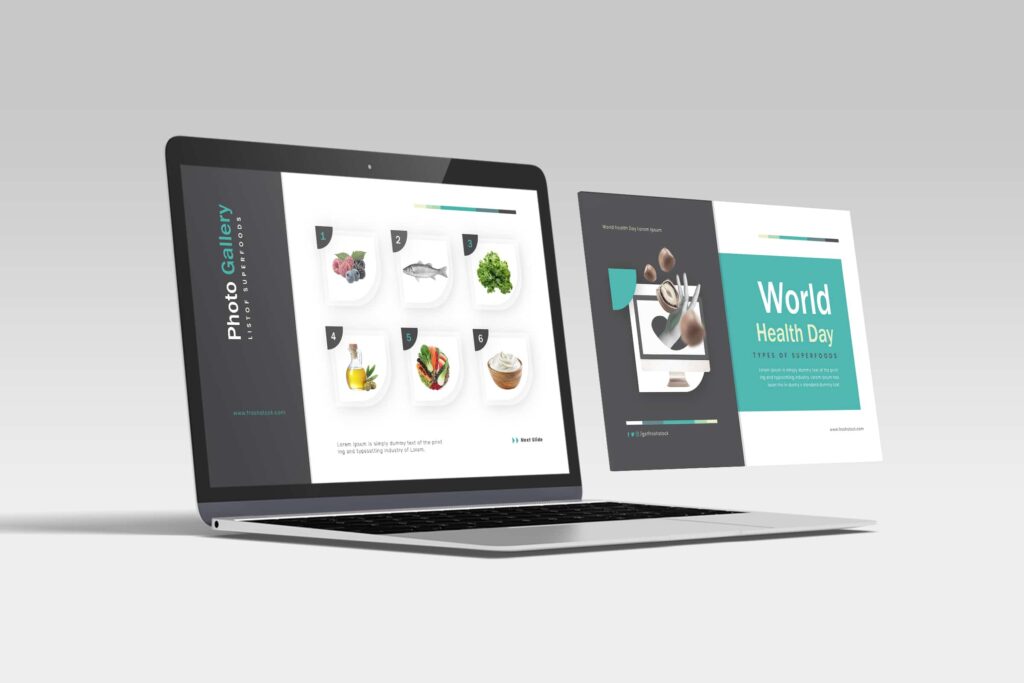
Clean
Sometimes, neutrality and simplicity work best — usually when you present to a broader audience. Just like designing for brand identity, a minimalist approach can have the maximum effect as long as it adheres to basic design principles. Rule of thumb? Use white space! Download this elegant template!
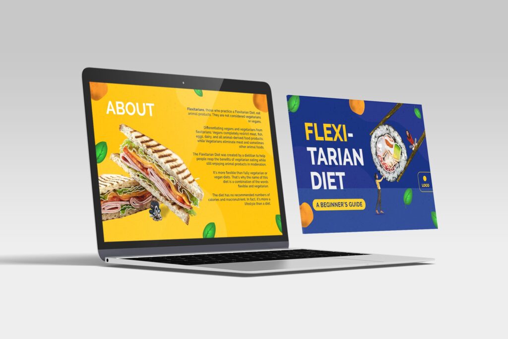
Creative
People might lose focus when they see old boring PowerPoint themes. Luckily, with unique elements that provoke attention and catch the eye, creative presentations are sure to keep your audience engaged. This creative PowerPoint template isn’t your regular presentation; it has some spunk, something you don’t see every day! Download this template!
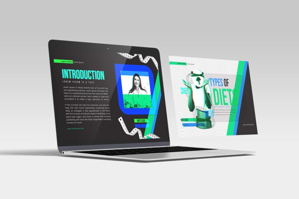
Modern
A modern presentation design is a blend of clean, creative, minimal, and trendy. “Modern” design can go so far as to become a bit edgy or experimental, but without breaking the boundaries of professionalism. Download this template!
Download your FREE presentation templates now!
What are Your Favorite Presentation Layout Ideas?
Creative freedom can be exhilarating — and overwhelming. When the possibilities are endless, it might feel easier to make mistakes than to make something cohesive.
That’s why design “rules” or best practices, even while posing restrictions, can make the design process much easier. And with ready-made Google slides or PowerPoint layouts, you can create stunning presentation decks that will impact and engage your audiences.
If presentation design is just not your thing, Design Pickle’s Presentation Design service is flat-rate and unlimited. Level up your slideshows and stand out from the competition. Check out our plans today!